We have heard of data visualization in this ever growing digital age and how it is shaping the trend in data journalism. But one may be wondering what this is all about. First, let us look at the two key words that make up the term “Data Visualization“, that is data and Visualization.
Data is information while Visualization is any technique for creating images, charts, graphs, diagrams, or animations to communicate data/messages. Visualization through visual imagery is an effective way to communicate abstract ideas/information.
Data visualization refers to the representation of data in a visual context, like a chart, graph or a map to help audiences better understand the significance of data or information. It is thus the graphical representation of information or data.
By using visual elements like charts, graphs, and maps, data visualization tools provide an accessible way to see and understand trends, outliers, and patterns in data.
Data visualization can be either static like those used in the print media like newspapers and magazines or interactive. The interactive visuals are the best in the digital age since this allows the user to engage with the content.
You can watch the video below to learn more about Data Visualization.
Application of Data Visualization
Data visualization can be used or applied in situations where one wants to do the following:
- Present statistics
- Show change over time – Trends
- Compare Values
- Show Connections
- Mapping
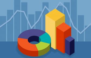
Types of Data Visualization
Data Visualisation is an essential part of working with data, as they are a way to condense large amounts of data into an easy to understand format. Often, the most difficult part of creating a data visualization is figuring out which chart type is best for the task at hand.
Your choice of the type will depend on multiple factors. What are the types of metrics, features, or other variables that you plan on plotting? Who is the audience that you plan on presenting to; is it just an initial exploration for yourself, or are you presenting to a broader audience? What is the kind of conclusion that you want the reader to draw?
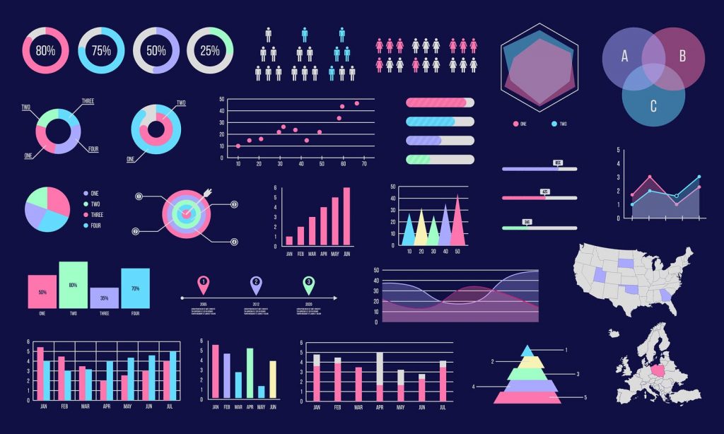
There are a number of types out there, each with different use cases and below are some of the common types of Data Visualization:
- Charts
- Graphs
- Maps
- Infographics
Advantages of data visualization
Visualizations of data can bring out insights to someone looking at the data for the first time, as well as convey findings to others who won’t see the raw data.
The amount of information that humans gain through vision is far beyond that of other organs. Data visualization aids human natural skills in enhancing data processing and organization efficiency and below are some of the advantages of data visualization.
- Attracts Interest: Data visualization is another form of visual art that grabs our interest and keeps our eyes on the message. Human eyes are able to absorb and grasp information more easily through visuals and images than texts and numerical figures. Data visualization does not only provide graphical representation of data but also allows changing the form, omitting what is not required, and browsing deeper to get further details. This is a great eye catcher and attracts the readers’ attention better and provides better communication. Additionally, it provides a great advantage over traditional methods of presenting data.
-
Direct Interaction with Data: Data Visualization also helps the companies to manipulate and interact with their data in a direct manner. One of the greatest strengths of data visualization is how it brings actionable insights to the surface. Unlike one-dimensional tables and charts that can only be viewed, data visualization tools enable users to interact with data
- Easy to internalize: If we can see something, we internalize it quickly. The human brain tends to process visual information far more easily than written information. Use of a chart or graph to summarize complex data ensures faster comprehension of relationships than cluttered reports or spreadsheets.
- When we see a chart, we quickly see trends. A good visualization tells a story, removing the noise from data and highlighting the useful information. It shows insights that may be missed in traditional reports.
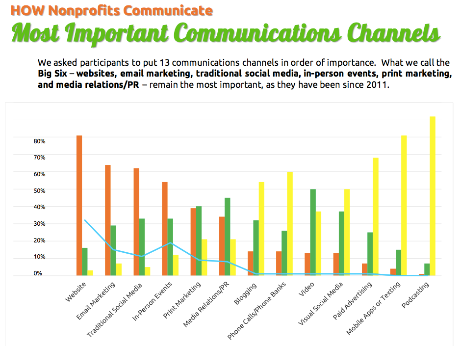
Below is graph obtained from “The 2015 Nonprofit Communications Trends Report (#NPcomm2015)
In the world of Big Data, data visualization tools and technologies are essential to analyze massive amounts of information and make data-driven decisions.
A s we may all know that Big Data is the future, there is no escape from data visualisation if such data is to be presented is the simplest form for better consumption by the targeted users.
Below is a video you can watch to maker you better understand and appreciate the future of Data Visualisation.
In my next article, we shall look at some of the best data visualization tools that are easy to use and their applicability.
Why You Need to Embrace Data Visualisation added by Philimon Badagawa on
View all posts by Philimon Badagawa →
